
Most small business owners aren’t quite sure what a chart of accounts is…let alone loving theirs! But your chart of accounts helps you not only understand what’s going on financially in your business, but also manage your business better. So let’s take a closer look…
The basic idea of accounting is to sort every financial transaction into a category, and use the categories for reporting to help the owner understand where their revenue is coming from and what they’re spending money on. The chart of accounts is simply the set of categories you use to group all your revenue and expenses.
At a basic level, you could have just two categories: every time you get a payment from a customer for anything, it would go into Revenue, and every time you spend money on anything, it would go into Expenses. But this doesn’t tell me much as a report; all I would see in my Profit & Loss report is that I earned $10,000 in revenue and spent $5,000 in expenses. That’s useful to know, but I probably want a little more detail to help me run my business.
What does a chart of accounts look like?
The chart of accounts is a list of all of your accounting categories. We divide the list into two parts: the balance sheet accounts, which track your assets (what your business owns) and your liabilities (what your business owes); and the profit & loss accounts, which track your revenue (money coming in) and expenses (money going out). In today’s article, we’ll start with the profit & loss accounts.
Profit & Loss Accounts
Let’s say I have a bakery and I sell two different items: pies and bread. To make them, I spend money on flour, butter, fruit, yeast, pie pans, bread pans, electricity, phone, and labor.
The Profit and Loss section of my chart of accounts might look something like this. Note that I’ve added more detailed sub-accounts under the Revenue and Expense accounts.
Profit & Loss accounts:
- Revenue
- Pie sales
- Bread sales
- Expenses
- Ingredients
- Pie ingredients
- Bread ingredients
- Pans
- Pie pans
- Bread pans
- Utilities
- Labor
- Ingredients
And here’s my report: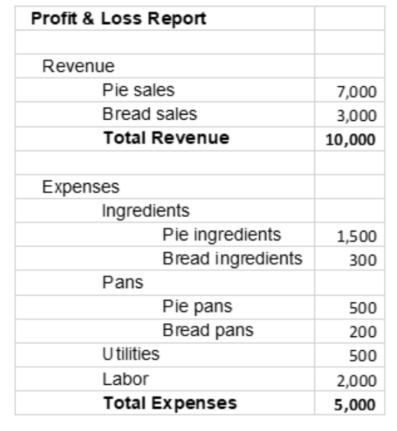
Now, when I get my report, instead of just seeing $10,000 revenue and $5,000 expenses, I can see I made $7,000 from pie sales and I spent $2,000 on pie ingredients and pie pans; I made $3,000 from bread sales and spent $500 on bread ingredients and bread pans. I also spent $500 on utilities and $2,000 on labor.
Can you see how I can make some business decisions because I have better information in my report, with the improved chart of accounts?
I can compare pies and bread to see which might be more profitable: for every dollar I earn for pies, I spend 29 cents on ingredients and pans (2000/7000), whereas for every dollar I earn for bread, I spend 17 cents on ingredients and pans (500/3000).
I can also monitor my “overhead” costs – labor, utilities, rent, and other categories that I want to track specifically.
What is the “right” chart of accounts for my business?
In our bakery example, we could group things differently. For example, I’ve grouped ingredients together and pans together in the chart above, but I could instead do the chart of accounts as shown below, grouping pie-related expenses together and bread-related expenses together. Neither way is “right”; whichever way makes sense to me is the way it should be done.
- Expenses
- Pies
- Pie ingredients
- Pie pans
- Bread
- Bread ingredients
- Bread pans
- Utilities
- Labor
- Pies
One thing to consider is that your categories should work for tax reporting. It’s a good idea to consult your tax professional to ensure you’re tracking revenue and expenses in categories that can easily be used for tax preparation. This can save you a lot of time and money at the end of the year, because the tax professional doesn’t need to go searching for numbers.
Another consideration is that it’s not a good idea to have an ultra-detailed chart of accounts; it just gets confusing. For example, I could track every type of fruit I use in my pies, but that would lead to a long list of ingredients and a very long report, while not really adding much to my decision-making information. Instead, I could use another “dimension” in my accounting system, such as a tag or class or project, to report in more detail about ingredients when I need to, without cluttering up my main profit & loss report.
The exercise of designing the chart of accounts to fit your information needs is a bit of an art, but Dunathan Consulting can help. Contact us today to discuss your options.
In a future post, we’ll discuss the Balance Sheet Accounts.